 What makes text in print or online easy to read? Readability is something those with good young eyes take for granted, but older people and those with some degree of vision impairment often have difficulty accessing important information -- in all sorts of documents, on labels (including drug and nutrition information labels), and on web sites.
It's a critical issue for anyone who wants to reach the older population, and in particular the aging baby-boomers, whose vision problems are just now beginning to become widely prevalent. For those with vision problems, legibility can make the crucial difference between being able to read or access important information—or not.
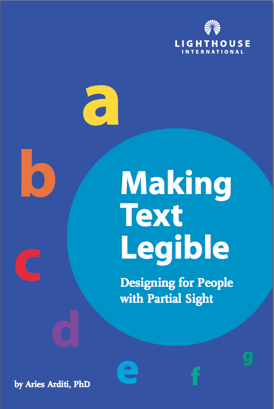
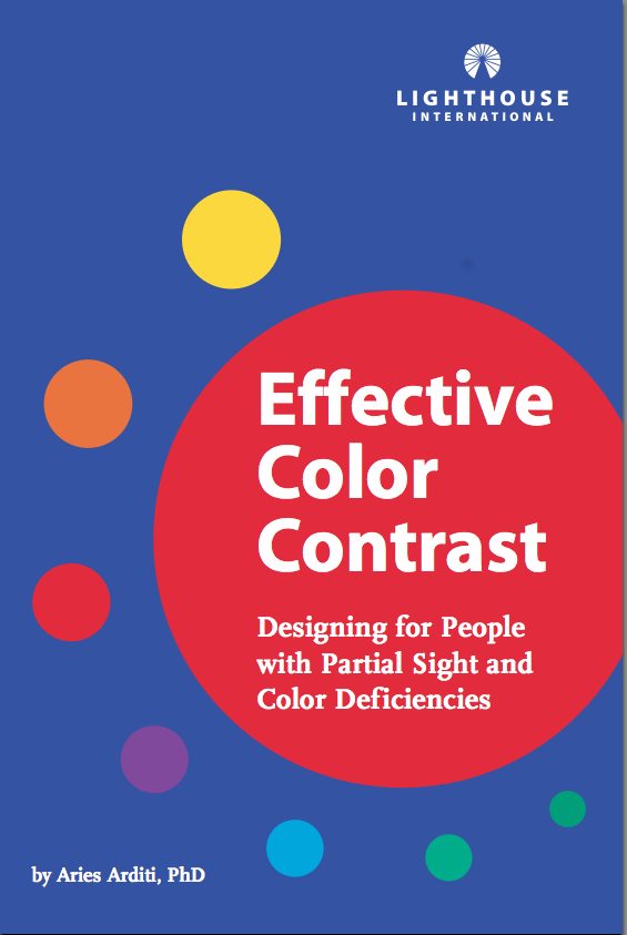
Some years ago we wrote two brochures that have become very popular with both web and print designers that describe in simple terms some of the most important principles for how to make text and other visual objects stand out and be readable. While written with low vision in mind, these principles apply to make documents readable for those with normal vision as well, and are thus useful for any print and most web designs. PDFs of the brochures can be downloaded here (Making Text Legible) and here (Effective Color Contrast), and web pages with versions of the brochures are available on the Lighthouse web site here (Making Text Legible) and here (Effective Color Contrast).
